
Behind the Score: How We Measure Grid Constraints
Most AI infrastructure bets fail at the grid — this is how we measure where and why

If you’re investing in AI infrastructure, you’re not betting on compute.
You’re betting on whether the grid can deliver power on time.
Most capital is being deployed as if power is available, delay is temporary, and capacity will scale to meet demand.
None of those assumptions hold.
Interconnection queues are opaque.
Timelines stretch into years.
And the difference between a viable project and a stranded one often comes down to constraints that don’t show up in standard models.
This is the layer most investors are missing.
We built the AI Grid Index to make those constraints visible.
Not to describe the grid — but to measure where it breaks.
Why This Matters
Not all megawatts are equal.
Not all interconnection queues represent real capacity.
And not all regions fail in the same way.
A large queue can signal opportunity — or it can signal congestion so severe that most projects never get built.
A fast-growing demand region can look attractive — until you realize the grid cannot absorb new load within any reasonable timeframe.
Most analysis stops at surface-level metrics.
This index goes one layer deeper — into the constraints that determine what gets built, what gets delayed, and what never connects.
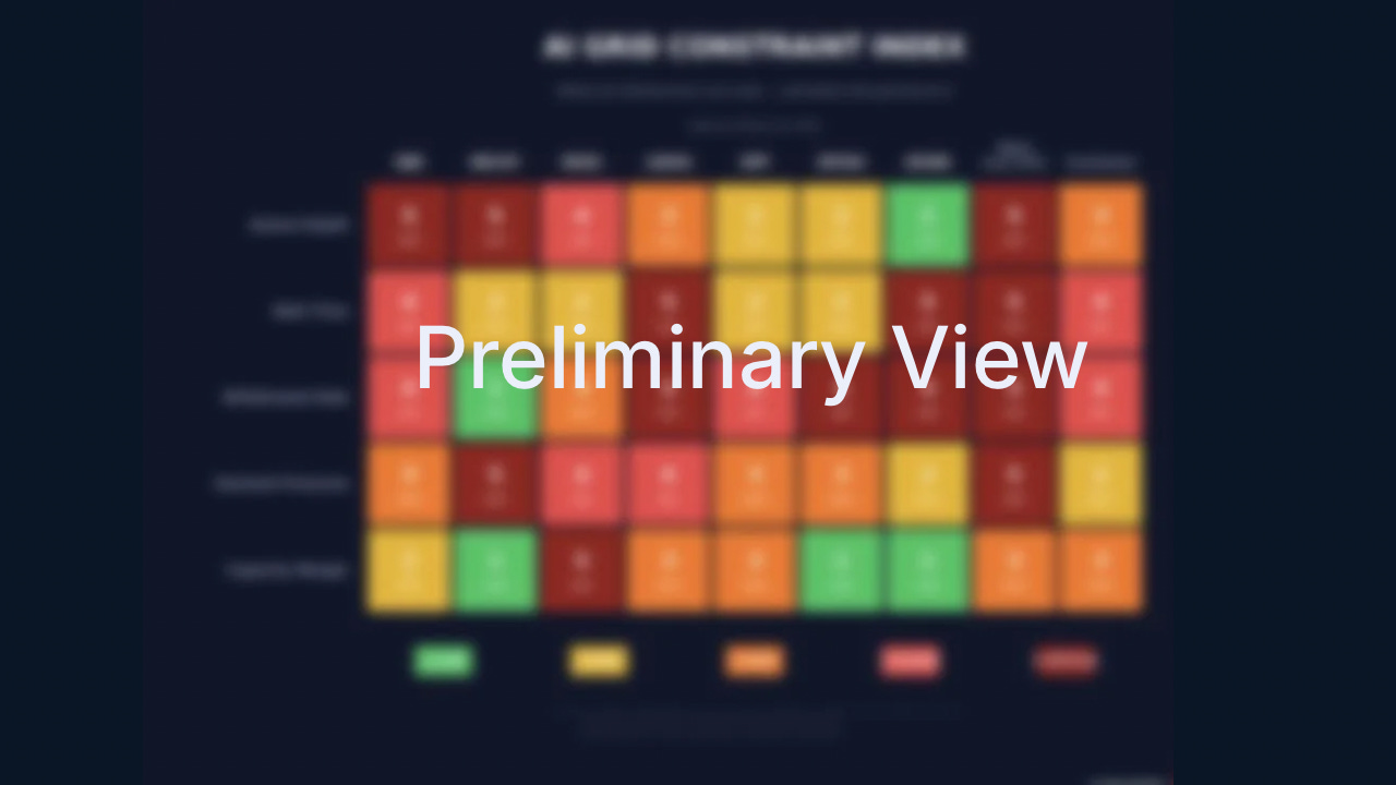
This article explains how the AI Grid Constraint Index is built.
The full index—updated weekly across U.S. grid regions—is available to paid subscribers.
Behind the Scores: The Math That Powers the Index
Last week, we published a heatmap scoring nine U.S. grid regions across five constraint dimensions. If you missed it, you can view it here. Disclaimer: it is only for paid subscribers.
Every score in that map comes from observable data.
If you’re making infrastructure decisions based on those scores, you should know what they represent.
We publish the methodology for one reason: To make the system legible.
Two Data Streams. Five Scores.
The index combines two independent data sources:
Interconnection queue data and federal energy data.
From these, we measure five constraint types:
Queue Depth — total gigawatts waiting to connect
Wait Time — how long projects remain in the queue
Withdrawal Rate — how many projects fail to reach completion
Demand Pressure — queue size relative to actual grid demand
Capacity Margin — how much (net) generation is leaving relative to demand
Each score isolates a different failure mode of the grid.
Together, they form a constraint profile — not just a snapshot.
Why This Matters
Queue data alone misses context.
A 200 GW queue on a grid serving 94 GW of demand (grid and transmission capacity similar) is very different from a 200 GW queue on a grid serving 14 GW.
The first is ~2x and the queue is likely to clear. The second is a fantasy: most projects will leave the queue, and never complete.
Each score isolates a different failure mode of the grid.
Together, they form a constraint profile — not just a snapshot.
What Each Score Actually Tells You
Queue Depth
High queue depth is often mistaken for growth.
In reality, it frequently signals congestion — more projects competing for limited interconnection capacity.
Wait Time
At four years or more, the queue stops functioning as a planning tool.
It becomes a bottleneck.
Withdrawal Rate
A high withdrawal rate reveals a broken process.
Most projects don’t fail because of capital — they fail because they cannot get connected.
Demand Pressure
Active queue GW divided by Average Demand.
This is where most models fail.
A large queue means nothing without demand context, but demand can’t outgrow the capacity of the grid to deliver the generation in the queue.
Capacity Margin
Retirements are the silent constraint.
Capacity leaving the grid can tighten conditions faster than new generation can replace it.
The Thresholds
Each score maps a continuous metric to a 1–5 scale using fixed thresholds, calibrated against 2024–2026 U.S. ISO data.
They are not arbitrary.
They were designed so that current conditions span the full range — with room for scores to move as constraints tighten or ease.
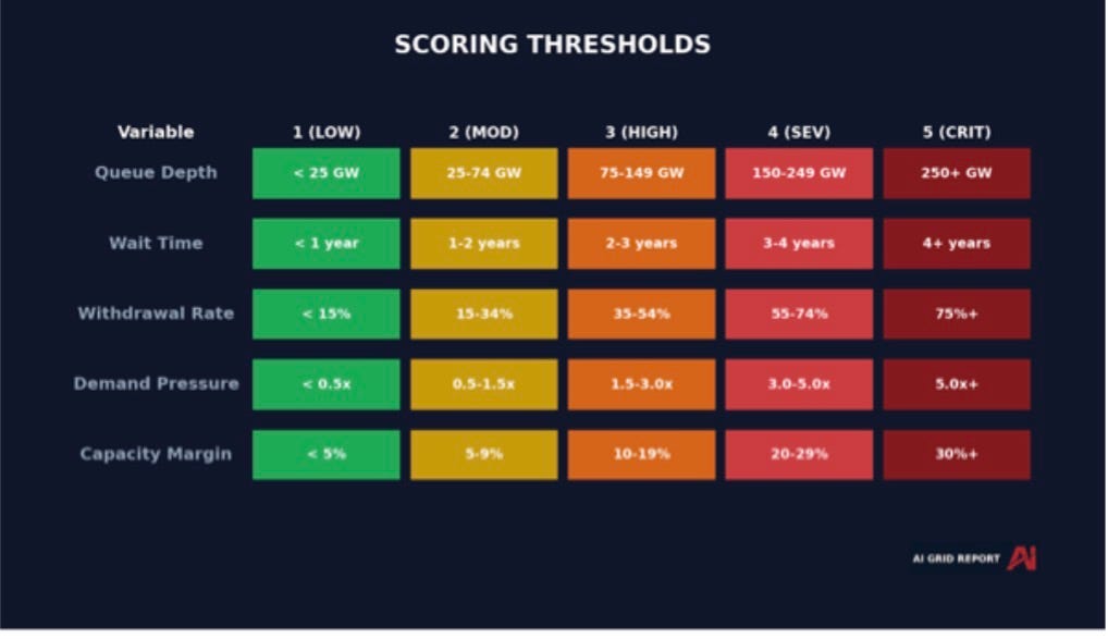
A score of 4 is “severe” because it is a system approaching failure.
A score of 5 is “critical” because it signals that the constraint is already binding.
The purpose of this scale is not classification — it is early detection.
Where Each Region Falls
Most investors are reading interconnection queues backwards.
They see large pipelines and assume future capacity.
In reality, large queues are often the clearest signal that the system is constrained.
Queue size is not a measure of growth.
It is a measure of competition for access.
The larger the queue, the harder it becomes to move projects through it.
In many regions, most of that “pipeline” will never convert into actual generation.
The implication is simple:
The biggest queues are often the worst places to build.
Queue size is not a measure of growth.
It is a measure of competition for access.
The larger the queue, the more constrained the system.
And in many regions, most of that “pipeline” will never convert into actual generation.
The implication is simple:
The biggest queues are often the worst places to build.
Interconnection Queues
Interconnection queues have quietly become the single biggest constraint in the AI infrastructure buildout.
Everyone is focused on how fast data centers can be constructed. That’s the wrong variable. The real gating factor is how long it takes to get power connected—and in most U.S. regions, that timeline is measured in years, not quarters.
This is the bottleneck most investors and operators are underestimating.
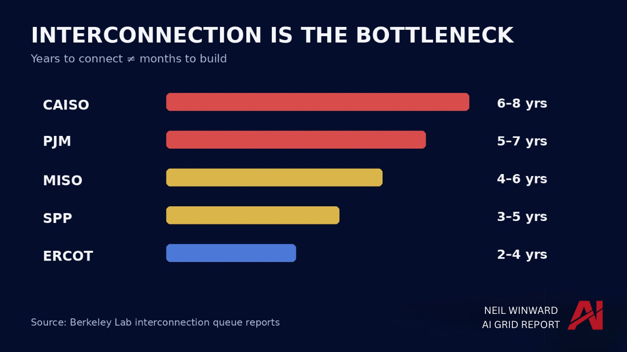
You can deploy capital, secure land, and build capacity relatively quickly. But without interconnection approval, none of it comes online. The result is a growing mismatch between AI-driven power demand and actual usable supply.
If these timelines don’t compress, the constraint won’t be compute—it will be electricity.
The Backlog Is Accelerating
The constraint isn’t just that interconnection queues are long—it’s that they’re getting longer, faster.
Each year, more generation enters the queue than actually gets built and connected. What looks like a delay problem on the surface is, in reality, a system that is falling further behind over time.
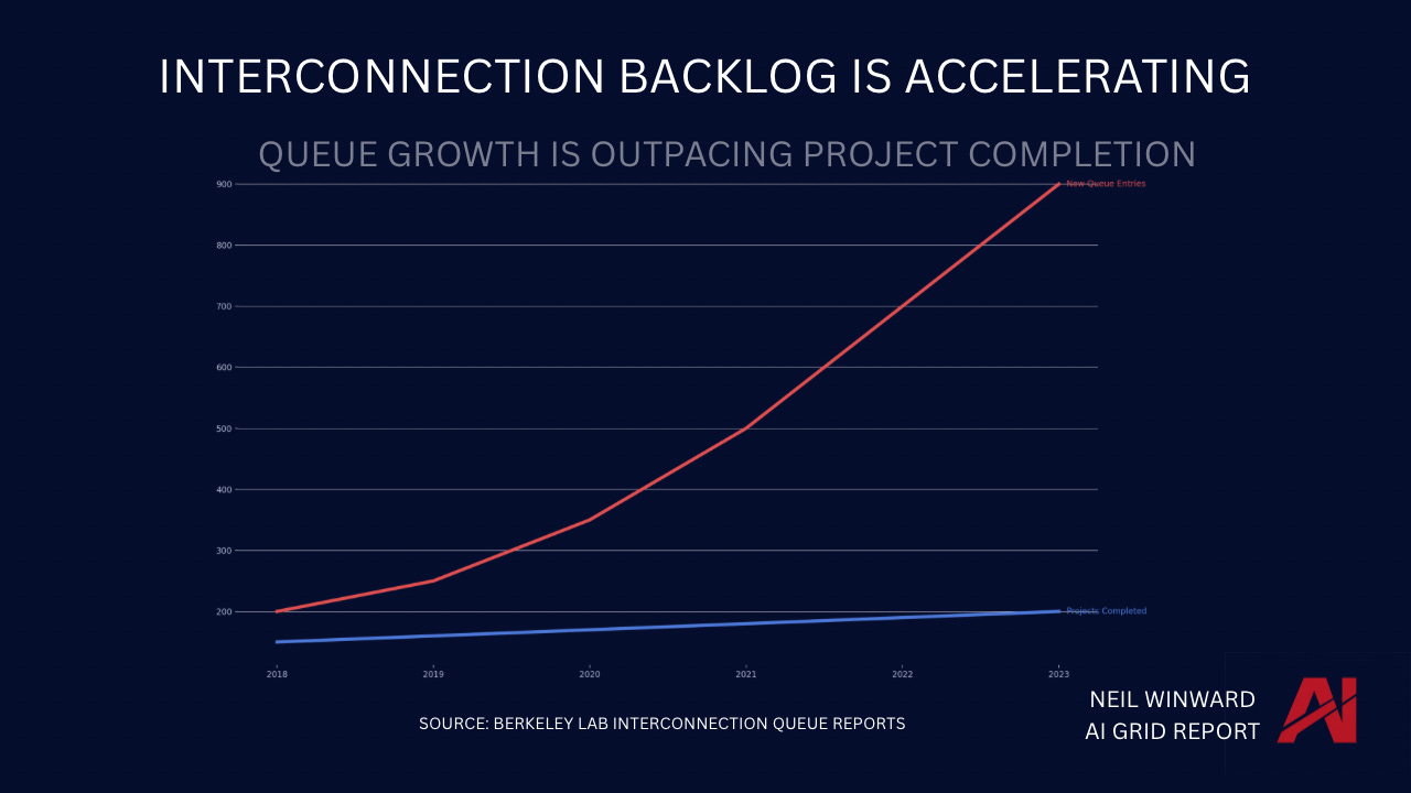
This is where the dynamic becomes structural.
When inflows consistently exceed completions, the backlog doesn’t stabilize—it compounds. Timelines stretch, uncertainty increases, and capital gets trapped in projects that can’t reach commercial operation.
If this trend continues, the limiting factor for AI infrastructure won’t be demand or capital.
It will be the grid’s ability to keep up.
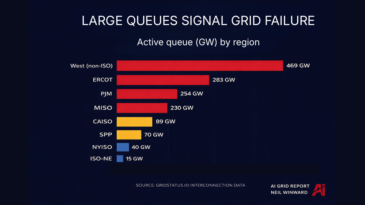
The Backlog Is Multiples of Demand
The scale of the backlog isn’t just large—it’s disproportionate to the system it’s trying to connect to.
In several U.S. power markets, the amount of generation waiting in interconnection queues is multiple times larger than the current peak demand those grids serve.
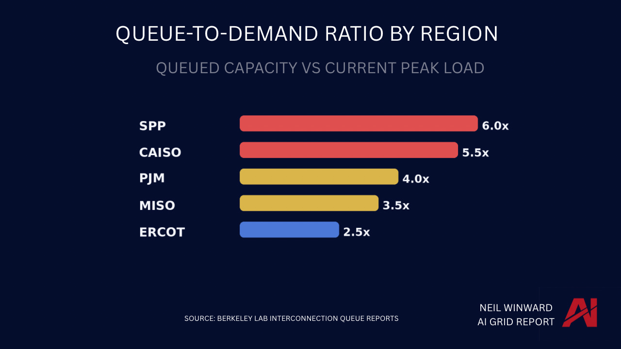
Backlogs at this scale are structurally misaligned with reality.
In several U.S. power markets, the volume of generation waiting in interconnection queues is multiple times larger than current peak demand. That doesn’t represent future capacity. It represents a filtering problem.
Most of these projects will never be built, but they still consume study time, planning resources, and grid attention. The result is a system where congestion exists not just in infrastructure, but in the process itself.
The constraint isn’t just supply. It’s the system deciding what supply is real.
Where AI Can Be Built
The constraints are not evenly distributed.
While interconnection delays and queue congestion are widespread, some regions still have structural advantages—faster timelines, available capacity, and more flexible market design.
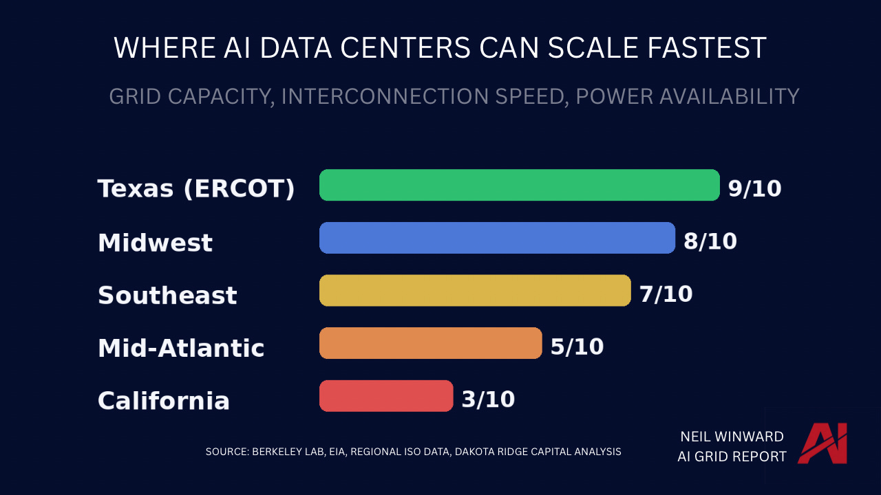
This is where the next wave of AI infrastructure will concentrate. Regions with shorter interconnection timelines and available power capacity will attract disproportionate investment, while constrained markets risk falling further behind regardless of demand. The geography of compute is increasingly becoming the geography of electricity.
This reveals something the heatmap cannot: how close each region is to tipping into the next level of constraint. Most people focus on score changes — that’s a lagging indicator. The real signal is proximity to the next threshold.
Where the Edge Is
The methodology is public. The data is observable. But the signal — where constraints are tightening before the market reacts — is not. Most people see the current state of the grid. We track how that state is changing, and where it is about to break. That’s the difference between reacting to constraints and positioning ahead of them.
The grid is tightening faster than most models update. By the time a constraint shows up in forecasts, capital has already been misallocated. We track those shifts in real time — where queues are building faster than they’re clearing, where timelines are extending before they’re reported, where regions are approaching constraint thresholds before the score changes. That’s where the edge lives.
Inside the Numbers
Every score in the index traces back to observable inputs.
Queue depth, wait times, withdrawal rates, demand pressure, and capacity margins are all derived from publicly available data—normalized and mapped against fixed thresholds.
We don’t publish the full dataset because the value isn’t in the raw numbers. It’s in how they’re interpreted.
What matters is not the exact figure—it’s how close each region is to constraint.
What We Don’t Know
No index is perfect. Queue data captures intent, not execution — most projects in the queue will never be built.
Non-ISO regions rely on proxy data that is directionally accurate but less granular.
EIA data lags real-time changes, and rapid shifts take time to appear. These are not flaws. They are conditions to understand when interpreting the signal.
Next Week: PJM — America’s Largest Grid Under Pressure
We go deeper into the largest U.S. power market—and what its constraints mean for AI infrastructure in the eastern corridor.
The AI Grid Report
Powering the infrastructure behind the AI economy.
This article explains how the AI Grid Constraint Index is built.
The full index—updated weekly across U.S. grid regions—is where the signal actually sits.
Fascinating and crucial data. Would be interesting to know the Why behind the different grid regions and why some solve all your criteria relatively quickly and others do not: political, regulatory, engineering....